


With the wide open opportunity for DIYers and newbies to create their own visual content these days comes the rampant creation of visual diarrhea.
It’s nothing to beat yourself up about! Like anything new, you just need to dedicate time to learning how to avoid the most common visual design mistakes.
One of the first parts of visual content mastery you need to focus on is how to avoid creating cringe worthy visuals.
You know, those visuals that scream AMATEUR. The ones that you can immediately label, regardless of your design prowess, low quality. The ones you’d’ rather rip out your eyes than be subjected to looking at. Ok, ok, so I’m getting a smidge dramatic.
The point is, visuals create the pause you need to get someone to stop long enough to take notice and open the proverbial door to deeper exploration. If your visuals make someone’s eyeballs run in the opposite direction the only thing you can look forward to is being doorbell ditched.
Truth: Because I’m not in the business of shaming and embarrassing folks that don’t know any better I’ll be using images I created {from real world inspiration} for the examples.
I’ve kept the examples to the same 3-4 images so you can see how truly harmful the offending elements are without overwhelming you with a ton of different images.
Each item in the list has two sets of examples so you can see varying degrees of the offending elements along with a corrected version of each for comparison.
Without further adieu…
Here are the 8 types of visual design mistakes you need to avoid in your visuals if you want to foster admiration and exploration for your content:
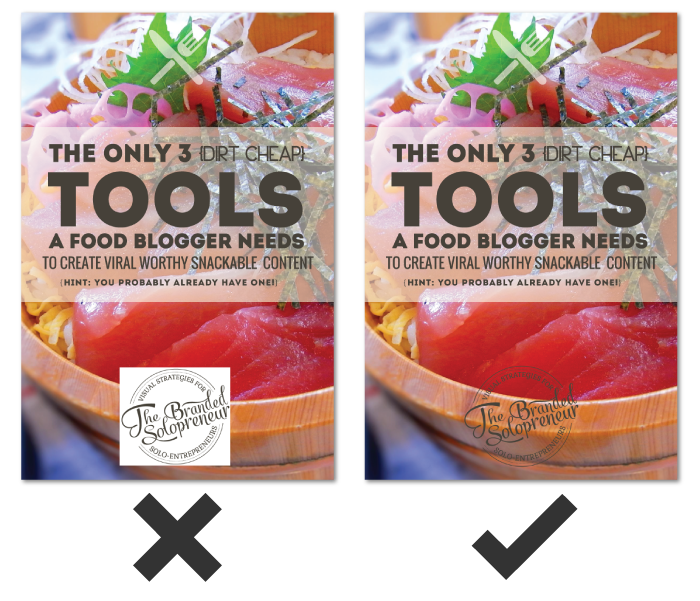
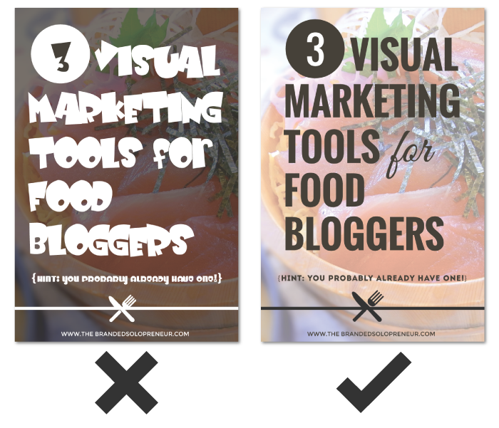
1. WHITE IS NOT THE NEW TRANSPARENT
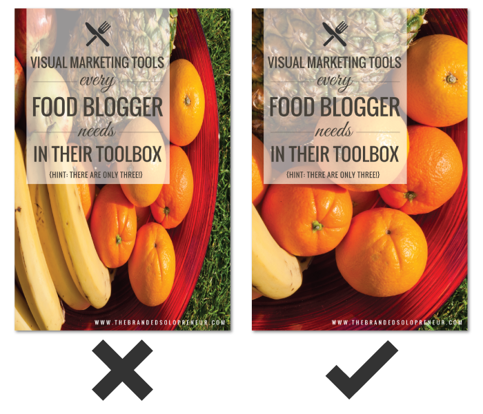
Contrary to popular misconception there are specific situations when you need a .png version of an image over a .jpeg version.
The most important reason to chose a .png over a .jpeg is transparency!
Have you ever see an image with a white box around it set on top of a patterned or colored background and thought ‘that looks wonky’? Yep, that’s the visual diarrhea I’m talking about.
You can not and will not trick anyone’s eye into believing you meant for that white box to be there, so don’t try. Use an image with a transparent background {.png file type} or don’t use it at all!
Here are two image set examples:
If you want to dive into the full line of idiosyncrasies between different image file types, here’s a great infographic from WhoIsHostingThis you should devour.
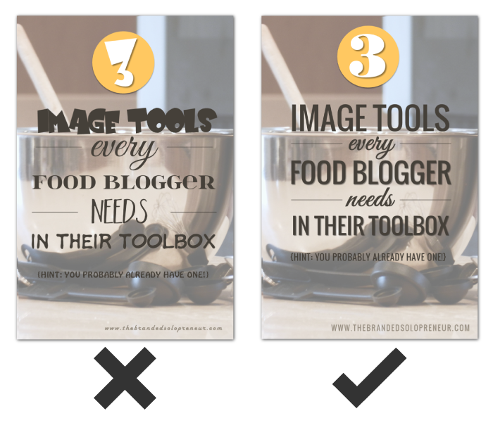
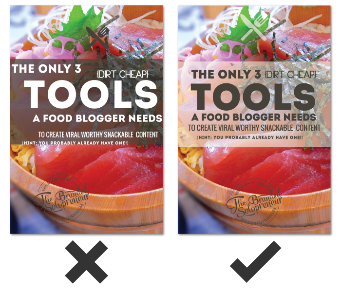
2. UNREADABLE FONTS, OH MY!
One of the most frequent visual design mistakes I see DIYers making is taking creative license in their typography {fonts and typefaces}.
Just because a font exists, doesn’t mean you should use it.
Just because a font looks cool, doesn’t mean you should use it.
Text on images is not where you want to flex your creativity or personal style in your visuals.
The purpose of text in visuals is to add relevant information, so it needs to be readable, in fact, SCANNABLE for that matter!
That doesn’t mean you have to use stale typefaces like Arial or Century Gothic. It does mean you need to be mindful of the legibility of a typeface in regards to the specific sizes and ways it will be used.
The fact is most typefaces, especially script and decorative typefaces, are better left admired and UNUSED!
Here are two image set examples:
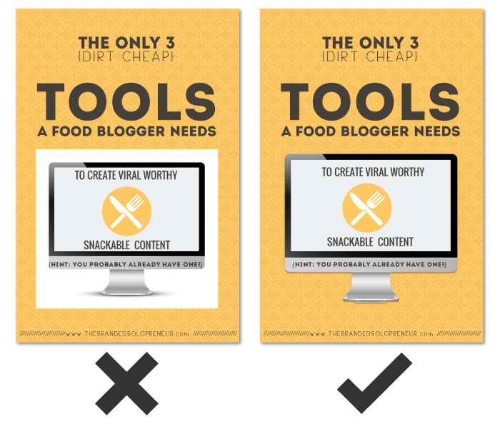
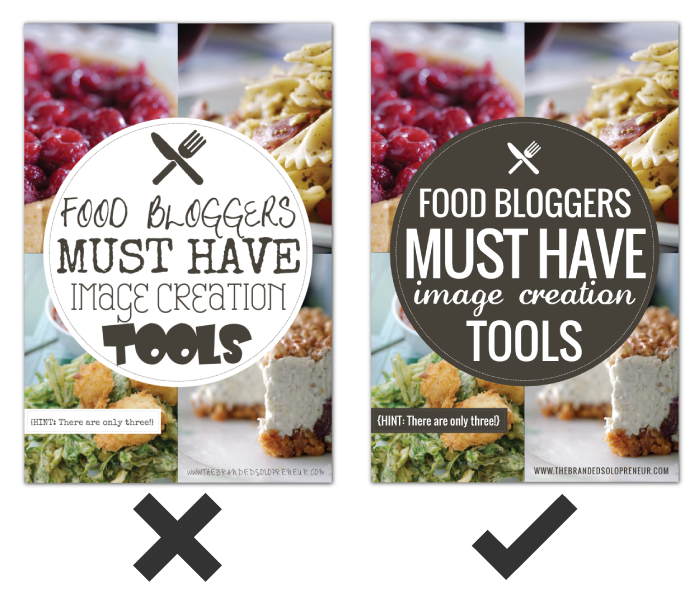
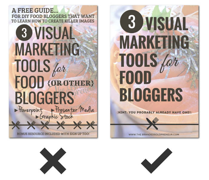
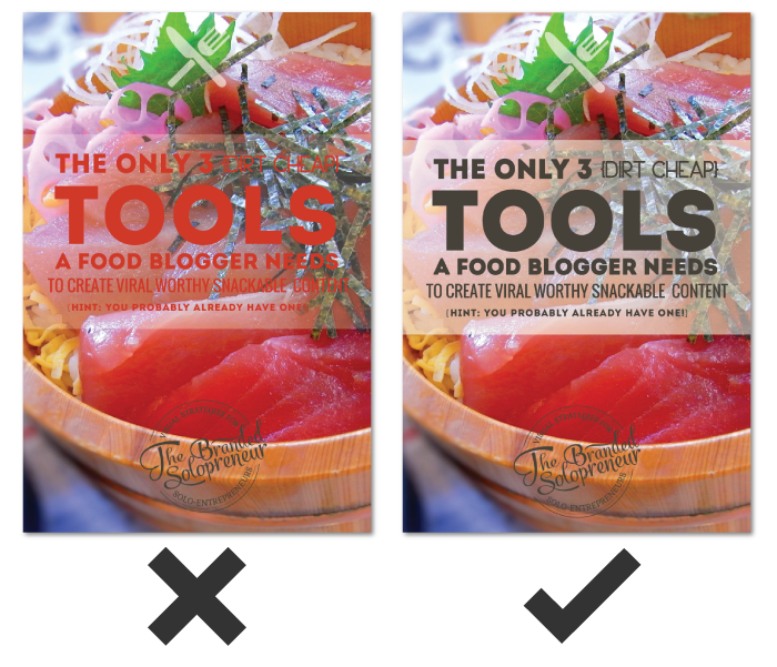
3. TOO MUCH IS NOT A GOOD THING
There IS, very much so, such a thing as ‘too many fonts’ when it comes to visuals.
Beside being a tell-tale sign of amateur design status, it’s also incredibly distracting. Like I said in #2, text in visuals is meant to inform, not display artistic taste.
Let me be brutally honest…
There’s NOTHING gained from using a different font on each line or string of text on your visuals. It doesn’t convey your personality. It doesn’t differentiate ideas or products. It doesn’t look creative. It is pure unequivocal visual diarrhea that devalues your content on sight. Capiche?
The hard and fast rule is to limit the number of typefaces you use in your images to two. This is not a rule to break, people!
Here are two image set examples:
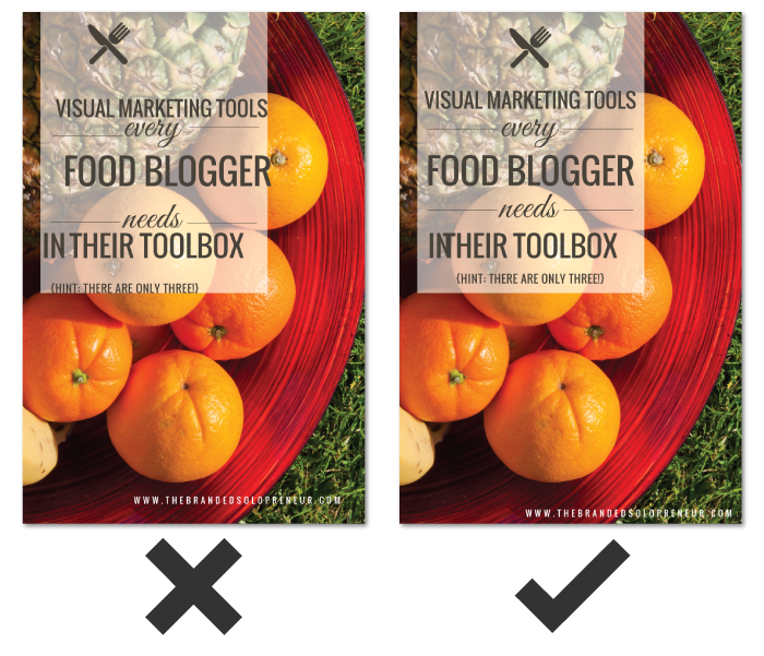
4. STRETCHING & SKEWING
Let me introduce you to your new BFF, Aspect Ratio.
Aspect Ratio meet Badass…Badass meet Aspect Ratio.
Aspect ratio isn’t scary design lingo to fear, it merely refers to the proportion relationship of a images width and height.
Let me break it down this way…
Take someone who is 5’9 tall and weighs 140 pounds, a rather slender build. If you squished him {NO, you can’t cut off his legs} down to 5’0 the 140 pounds would have to be redistributed, making his horizontal measurements wider. Hence why 140lbs fits someone 5’0 differently then someone 5’9.
The same sort of effect happens with images. If you increase or decrease the height of an image {by dragging the top or bottom of your image up or down} without increasing or decreasing the width of an image {dragging the sides of your image in or out} the aspect ratio is changed…and skewed.
To keep the height and width proportionate while manipulating the size of an image you need to maintain the aspect ratio. That means the proportion between the height and width has to be maintained regardless of total image size.
To go back to the example of the person I mentioned above. To keep the same slender frame {i.e proportions} at 5’0 that you had at 5’9 you would need to drop some weight. Make sense?
Here are two image set examples:
5. PIXEL-HATED
If you have a small photograph, let’s say 100px by 150px, how can you use it for a background on an image that’s 735 x 1100?
You CAN’T!
There is nothing magical about making a photograph bigger than it is. Period.
Photographs are made up of hundreds to thousands {depending on size} of tiny squares of color called pixels. When you increase the size of the photograph your computer has to fill in the new real estate with its best guess of color, which causes a grainy or pixelated look.
If you want to use photographs or raster images in your visuals the burden to find ones that are big enough falls on you. Skirting that corner is a guarantee visual design mistake in the making.
Here are two image set examples:
![]()
![]()
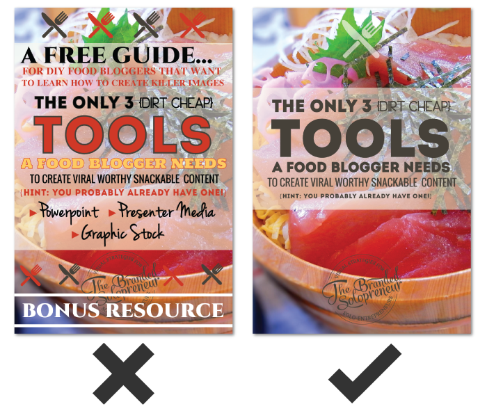
6. EVERYTHING BUT THE KITCHEN SINK
A lot of us are infamous for our long winded rambles and yammering {GUILTY!}, which sometimes happens when you’re passionate or geeked out on a topic.
However, what I call a ‘visual yammer’ must be avoided at all costs!
I get that getting someone’s attention for longer than a couple seconds is tough in our bright light laden world. It might seem intuitive to put every applicable detail you can think of on your image so a viewer is ‘in the know’ but all that’s going to do is turn your image into a hot steaming pile of you know what.
I’m not going to make a lot of fans by saying this {but when has that ever stopped me}…Google Hangout hosts…you guys are some of the worst offenders of this!
Here’s the deal…
Think about how small images are on most devices that are used to surf the web and social. Mobile anyone?
Cramming every detail of your show, event, or product is NOT doing you a service. It’s actually detrimental because there’s a lot more to base a reactive judgment on. Instead, you need to ‘leave something to the imagination’.
You aren’t going to get more clicks because you visually give it all up right away, but you ARE going to overwhelm folks. Visual real estate is small. It needs to be used wisely. List out all the info you want to convey and start distilling.
If I circle back to HOA shows, the event cover should first and foremost create a visually recognizable branding pattern, which may or may not include showcasing the host and the guests. It doesn’t include every single detail about the show.
If someone is interested and clicks to view the event page then they will see your video thumbnail which will convey the next portion of important or relevant information.
Don’t fall victim to visual yammering. Instead, create a highly devourable visual that get folks to pause long enough that they CHOOSE to explore more. Then, and only then, should you provide more information.
It’s called courting, folks, and it is a journey!
Here are two image set examples:
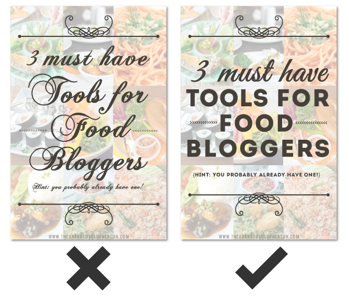
7. ALIGNMENT DEFICIENT
Another easy to fix visual design mistake is lack of alignment. The truth is, creating lines with visual elements makes processing information easier. In other words, having graphics and text line up in uniform ways makes it easier for those viewing it to process the information.
Alignment is visual delight for the eyes.
On the flip side, no recognizable order for the eye to naturally follow leaves a viewer distracted and a message lost.
Use the alignment features available in your image creator. If it doesn’t have any alignment options…RUN! {<—- that means it’s a crappy image creation tool}
Alignment helps create balance in visuals. Without balance you’ve got a visual heap of haphazard junk.
Here are two image set examples:
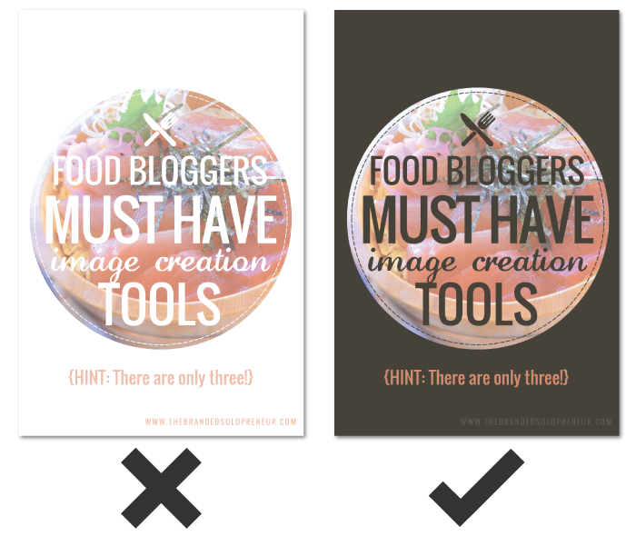
8. CONTRAST-OPHY
There’s a reason certain colors look good on certain skin tones and with certain eye colors. It’s called contrast. It’s just as important when it comes to visuals.
You want elements in your images {i.e text, graphic elements, backgrounds, etc} to compliment and differentiate themselves in a way that’s visually stimulating. You do that through contrast.
If you have a dark background, you need light elements to put over it and vice versa. A lack of contrast leads to a lack of impact, which I’m sure isn’t your goal when creating your visual content.
Here are two image set examples:
WRAP UP
There you have it!
If I came off extra tough lovin it’s only because I’m ferociously committed to helping you learn how to avoid the common visual design mistakes that lead to visual diarrhea.
This article isn’t about conforming to a certain look. It’s not about repressing your personality or style. It’s not meant to make you feel bad for making any of these common visual design mistakes. We’ve all done some of them at one time or another. This article is about helping you create visuals that deserve that coveted pause.
Remember, visuals create that pause that invites viewers on a journey of further exploration into your content. They’re the invitation to the party, which is where the real connections happen.
Let this list guide you and navigate you through the rough waters of DIY design. May it grant you more pauses and take you to new places. Together let’s rid our digital world of all that visual STANK!
GRAB YOUR FREE COPY OF
THE QUICK & DIRTY GUIDE TO BRANDING FOR SOLOPRENEURS

This 25+ page ebook is a bloat free recipe that will help you gather, prepare and assemble ALL six main ingredients you need to create a unique AF brand identity your peeps will love eye guzzling.
PLUS, the entire ebook is loaded with tons of exercises, resources and examples, so you’ll have everything you need to start creating your brand identity TODAY, regardless of where you are in your business.
awesome post by dre, thanks a lot for sharing.
Anytime, brotha man! {fist bump}
Another great collection of specific tips and examples, Dre! Those specifics are what make the info meaningful. (Not sure how I missed this back when I first found this site but glad I came across it now.) And thank you for being the type of person to create examples of offending designs instead of shaming those who are still learning and making their way. Just another way it’s so clear to us that you are looking out for us DIY Solopreneurs.
NEVER would I shame those learning, I know what a biotch that learning curve can be. I’m ONLY interested in teaching and empowering so thank you for giving me love for that and this article. Here’s to beefing up your visual creation skills and kicking some ass with them.
As always, you’re the best, Melissa! {BIG ass high five}
I am a huge fan of your blog Dre. I have been learning alot from you. This post is again aweseome. Love it.
I la la loooove hearing that, Dina! ROCK ON, lady…and holler anytime you have questions!
It’s my first time on your blog but I’ll definitely come back!
I’m a design amateur myself and I can’t believe how much I learned and how much my design skills improve in the past few years. I’ve certainly been guilty of using unreadable fonts in the past and some readers pointed it out. Now I’m more careful about that.
What I love in your post is that the difference of quality between the two images is obvious but not THAT obvious. I mean that you didn’t go full on spam picture from the 90s. I love it because it shows how important small details are in design.
Another flaw I notice in a lot of amateur images is the lack of white space. We used to have terrible line spacing on our blog and adding a few more pixels changed everything.
Isn’t that the truth, Aurelie! The slighest tweaks can make the biggest impact in our visual content! Can’t thank you enough for all the love, but maybe this big ass virtual high five will be a good start! Don’t you go being a stranger now, you hear me! ; ) Here’s to basking in the glory of white space…
Another excellent article, Dre!
I love the option of blurring photos. It’s my go-to method of making my text pop.
I’ll be the first one to admit that when I started out with images/text, I was horrible! I’ve saved some of my beginner stuff just to look back and see how far I’ve come.
You use the blur technique nicely, Carrie-Anne. I’ve seen a ton of growth in your visual mastery game, so keep honing and creating great sh*t lady – you ROCK!
The post I wish I had written! Nice one.
I kinda just gave up telling people where they are going wrong. :> You are there to save them all
I can’t help it, Ashley…it’s tragic to see this stuff. I know most just don’t know better so if this helps, great. If they don’t want to accept reality, that’s their decision.
Unsurprisingly, I’ve produced visual diarrhea. You know what would be cool Dre? Some kind of coaching & training service which also gives bloggers constructive, personalized feedback on the visuals they create.
In the future I’d definately consider using a service like that if someone offered it.
Eeh, we all have at some point, Jeffrey – don’t sweat it!
I’m adding a variety of services as we speak {that are exactly along these lines}, so stay tuned.
Hey Dre!
I’m brand new to your blog and I’m quite glad I stopped by. Everyone out there creating their own visual content should read this post! There’s without a doubt a lot of horseshit visuals on social media. What’s funny to me is that these people expect others to buy from them. Thanks so much for the great information and I love your sense of humor. ?
A-friggin-men to that, Jess! More people than would like to admit commit some serious visual sins in their imagery so I’ve made it my mission to help them edumacate themselves. Saving eyeballs from bleeding is my way of giving back.
Big ass high five for the comment and love, girl. I hope you won’t be a stranger now that you’ve discovered my rabbit hole! ; )
What a great post, Dre! The examples you created really illustrate your points in a fun way. Thanks for sharing!
High five for the love, Joanna!
Life changing post! Why didn’t someone tell me this 3 years ago.
Thank goodness you are in my life now, Dre ?
Sue
I’m beyond stoked to be a part of your visual mastery journey, Sue! I have a sneaking suspicion you’re going to be one of my allstar students…I can’t friggin wait to see everything come to form for you!
Dre- I found myself laughing while I read this because I MAY know someone who knows someone who has violated one or 2 of these rules ?
WE all need a kick in the arse at times and this is a great visual branding guide for newbies. Thanks for another great post.
I bet that friend of a friend is still a pretty epic badass, Jolynn! High five for the social love you continued to shower me with – you ROCK girl.
True,there’s a stark difference in the right and the wrong images,this post was really helpful,i hope to learn and yes,tough love’s the best ? have a great day.
Tough love {key word being ‘love’} is the only way I know how to do it, so I’m thankful badasses like you can appreciate it, Seema. You ROCK!
You always make my branding heart sing with joy Dre! Thank you for this sensational post – especially the fabulous examples to help drive home the visual experience point. YOU are AWE*MAZING and soooo Andelicious!
I fired myself from doing DIY visuals years ago. I know great design when I see it, I just can’t create it. Thank Goddess you’re here to save the day and money – woo hoo and MUAH!
This post wouldn’t exist if you hadn’t give me the idea, lady! Better add one more martini to the bar tab I owe ya. Now stop it, you’re giving this badass a wicked case of warm & fuzzies.
The truth will hurt some Andrea but this is a fantastic piece which touches on some of the most common blunders when it comes to using visuals. I find the biggest impact of poor visual marketing is leaving an unprofessional image on your potential customer!
High-friggin-five to that, Kapil! Tough lovin may not be for everyone but it’s the way I dole out my mastery. I’m stoked to hear that approach is a-ok with you brotha. May it save bleeding eyeballs around the world.
ANDREA!
You’re supposed to be helping me, not giving me homework. I mean seriously, my design work is appalling and I was hoping that your posts would help me improve straight away – not make me realise that I’m YEARS behind.
I’m crying a bit (a lot) inside.
Sorry, okay? I’ll revise and do better next time.
Why couldn’t I know all this stuff years ago? It’s a sharp learning curve, but a great one nonetheless.
Don’t ever let your badassery slip Miss Beltrami!
Luke
Haha, your comments always make me LOL so if that’s the product of driving you up a wall, I’m afraid I won’t be able to stop, Luke!
You didn’t know it years ago because there was a sassypants blogger that was meant to show you the light lil grasshopper.
Badassery in non-slippage mode.
I’m glad there’s a sassypants to help this sissypants along!
…even if you are two years too late. *scowls*
Andrea, as always… great information. I’m learning more and more from you with every post you publish. Thanks, Brandon.
Appreciate the love & support brotha!
Another fabulous post Dre! Love the example, clear and yes very cringe-worthy (the ones on the left, obviously).
Big ass high five for all the love and sharing on this one, Antoinette – can’t thank you enough girl!