


This is a guest post by Amanda K. Jones from LaptopLifestyleMom.com
Photoshop is the mother of all image editing programs and most people assume that it wields power way beyond their level of understanding. While it does have quite a few bells and whistles that you’ll probably never use as a solopreneur it’s really not as complicated as you think. If you’ve taken the time to learn other image editing programs like PicMonkey or Canva there’s no reason why you can’t learn Photoshop.
The purpose of this newbie friendly guide to creating images with Photoshop is to help shorten your learning curve and to point out what tools are most useful as you set out to create kick-ass graphics for your never-ending biz projects.
OK so why even take the time to learn Photoshop when PicMonkey, Canva, and many other online tools seem to work just as well?
Good question!
6 reason why leanring Photoshop is worth your time
1. It’s the complete package. Why do you think stores like Walmart, Meijer, and Target have become so popular? People don’t like wasting their time and driving around to 4 different stores to buy groceries, a roll of duct tape, new underwear, and a card for their Aunt Matilda’s birthday. If you spend any amount of time using other image editing software you’ll learn that each program is good for one thing but maybe not-so-good at something else. Jumping around from program to program wastes a lot of time. Photoshop is your one-stop-shop when it comes to creating web graphics.
2. It’s affordable. When I first started learning Photoshop Bill Clinton was President and the full program would set you back several hundred dollars. That’s a tough pill to swallow when you’re just getting started. But today we have have access to all the bells and whistles for only $9.99 a month. Seriously…that’s money well spent. With your monthly plan you’ll always have access to the most up-to-date version and you can work seamlessly across all your devices.
3. It will make you more efficient. Do you find yourself creating the same type of images over and over again? With features like ACTIONS and PRESETS you can create image templates and batch your branded images like a boss. You’ll spend minutes instead of hours whipping up graphics for your next blog post or product launch.
4. Photoshop can make you money. Even if you don’t consider yourself a “designer” you can use basic Photoshop skills to create graphics that people will buy. Mood boards, brand boards, website mockups, patterns, backgrounds, logos, printables, ads, infographics, and the list goes on and on.
5. You have more control over the end-product. With other programs you don’t always have full control over how your image is saved once it’s done. Photoshop allows you to save, optimize, and compress JPEG, PNG, and GIF images so they load faster on your website and you never have to worry about transparency issues.
6. Layers. Layers, layers and more layers. If you spend enough time working in PicMonkey or Canva you’ll quickly learn to appreciate the beauty of layers. Layers allow you to EASILY select and work on different areas of your image without messing up everything else in the process. And when you save your image as a PSD (Photoshop) file you can open it later and all your beautiful layers will still be there.
How to Take Photoshop for a Test Drive
Go to the Adobe website to download a free 30-day trial. Yes, seriously…do it! The rest of this blog post will be a lot more fun if you can follow along.
Most Commonly Used Photoshop Tools for Web-Based Projects
Before we dive into our first-ever Photoshop project let’s get the lay of the land and take a quick tour of the most commonly used tools for us folks who earn our sweat-equity on the web.
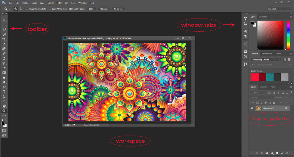
Toolbar: The toolbar is full of well, tools. But you’ll find yourself using certain tools more than others depending on your workflow and what types of projects you work on the most. You’ll see there’s a little arrow in the bottom right corner of every tool. If you right-click on the tool you’ll get a pop-up menu with, you guessed it…more tools.
The tools I tend to use the most are:
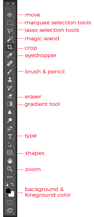
Move: moves around the content of whatever layer is selected in the layers palette
Marquee selection tools: allows you to make selections in different shapes.
Lasso selection tools: allows you to make irregular shaped selections.
Magic wand: allows you to make selections based on color
Crop: used to re-size your image
Eyedropper: enables you to select certain colors from your image
Brush & pencil: used for coloring or drawing
Eraser: take a wild guess
Gradient & paint bucket: fills the layer or a selected area with color or gradient
Type:add text to your image
Shapes: create different shapes
Zoom: pan in and out on your image to see more detail or get a wider perspective
Background/Foreground color: allows quick access to your most recently used colors
Workspace: the workspace is where all the magic happens as you create and edit your images.
Window Tabs/palettes: instead of constantly going up to the menu bar you can store some of your more commonly used menu items as window tabs/palettes. Some of my favorites are the Brush, Paragraph/Character (for customizing text), and History. The History palette is probably one of my most clicked buttons in Photoshop because it allows you to go back in time and fix any mistakes you made all the way back to the moment you first created your image.
Layers palette: as you continue to build your image each layer will appear in the layers palette. Here you’ll also see tabs for Channels and Paths but you don’t have to worry much about these until you reach the next level of Photoshop geekiness.
Best Practices for Creating a New Image for the Web
OK so now you know what’s what and you’re finally ready to start kicking out some badass images for your biz. Like I said, using Photoshop to create web graphics is a wee bit different than using it for editing photos.
So let me give you a few tips right off the bat.
Create a new image by going to FILE >> NEW.
WHOA!
A pop-up box appears with a bunch of different choices. This is where a lot of people start to bail. But you’re a badass so we’re gonna persevere and see this thing through to the end.
Let’s break this puppy down:
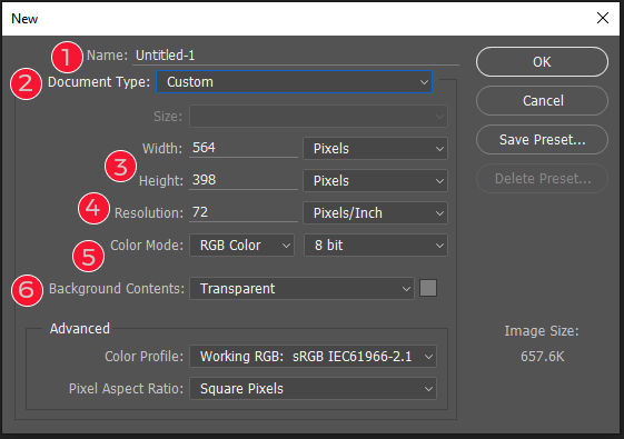
1. You can name your image now or wait until you save it. I typically just leave this the way it is.
2. The default document type is CUSTOM but Photoshop has some presets you can use like U.S. Letter, International Letter, etc. If an image is copied to your clipboard the default document will change to CLIPBOARD. In that case all you have to do is hit OK and once the blank file opens in Photoshop you can hit CTRL + V or CMD + V or EDIT > PASTE and your copied image will appear all ready to go. You can also create your own custom presets which is kinda neat. Let’s say your blog post images are 800 x 1200. You can save a BLOG POST preset and each time you want to create a new blog post image you can simply select it from the drop-down menu. Snazzy!
3. For web graphics you’ll want to stick with pixels but Photoshop has other options like inches, centimeters, etc.
4. Unless you plan on printing your graphics you’ll want to use 72 pixels/inch for your resolution. This will keep your file sizes down. However if you think you might be printing something (like a logo) you can go up to 300 pixels/inch for the best quality. But you’ll have to make sure you optimize the image you plan on using for the web. You can always make an image smaller but you can never make it bigger so go bigger if you think your image might one day be destined for print.
5. You could spend an entire semester learning about color modes at graphic design school but for now let’s just say that RGB color is what we want to use to make images for the web.
Here Photoshop gives you free will to choose whatever type of background you want but I leave it set to transparent 100% of the time.
How to Create a Blog Image Template with Photoshop
Alright, so now that you know the ins and outs of creating a new image for the web let’s get to work on creating some badass branded blog images.
Now, I know you’re a smart cookie and you’ve already created your branding guidelines which include your logo, submark/watermark, color palette, textures/patterns, fonts and brand elements. If not you really need to get your hands on the The Quick & Dirty Guide to Branding for Solopreneurs
With our branding guidelines in place let’s see just how easy it can be to create a blog image template with Photoshop. Your first image will probably take a little extra time, but once you lay down the groundwork you’ll be whipping out images for your blog in no time flat.
Let’s say as part of your brand strategy you’ve decided to use funky patterns in the background of your images and then a transparent overlay using one of the colors from your color palette. Nice!
A lot of stock photography websites also include illustrations you can use as backgrounds for your blog images. An important thing to keep in mind is that you don’t have to use the image exactly as it appears. You’re a Photoshop ninja so you have the authority to make your cookie-cutter stock photo wield to your immense power!
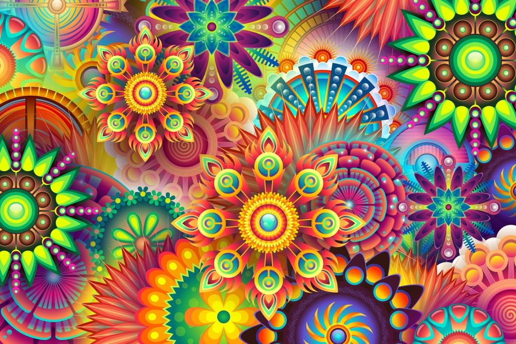
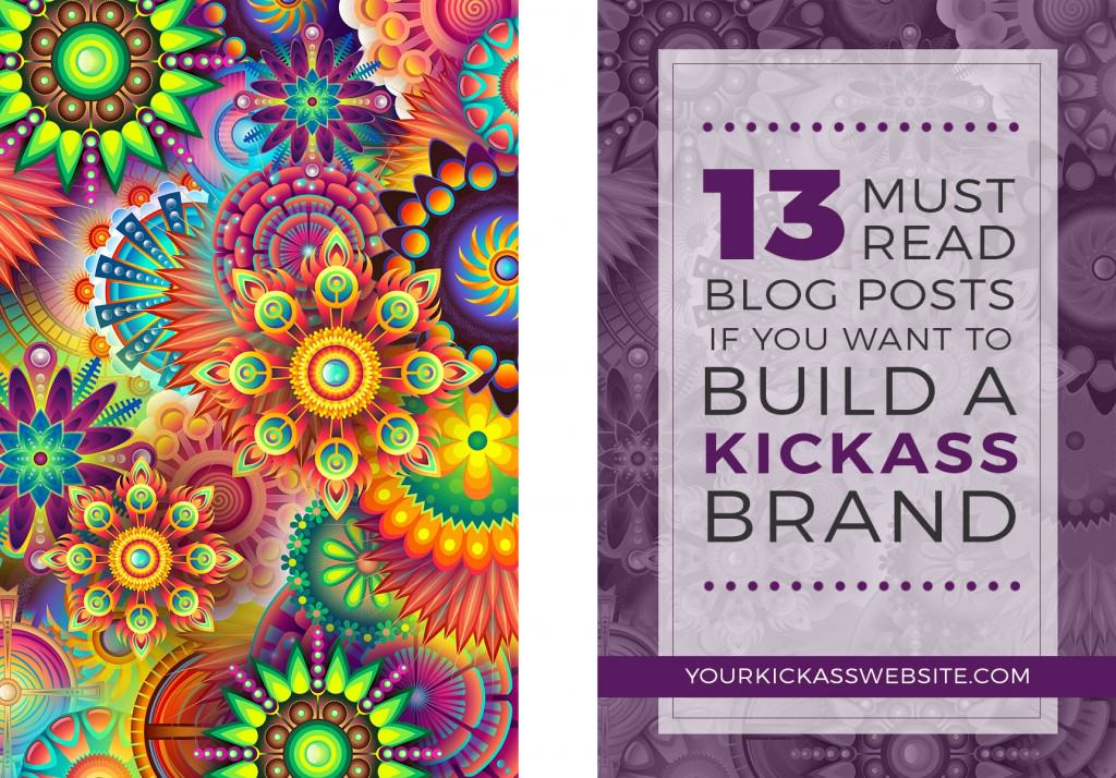
A quick search on Pixaby leads us to this image which definitely fits our funky pattern criteria.
1. Once we have our background image downloaded to our computer we can open it in Photoshop. Go to FILE > OPEN and locate the image on your hard drive.
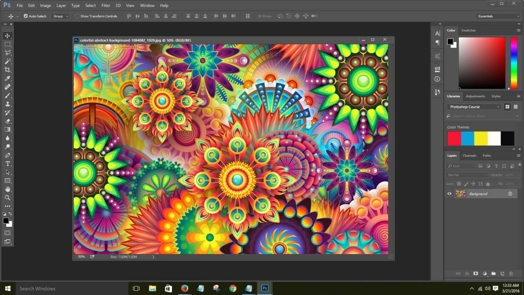
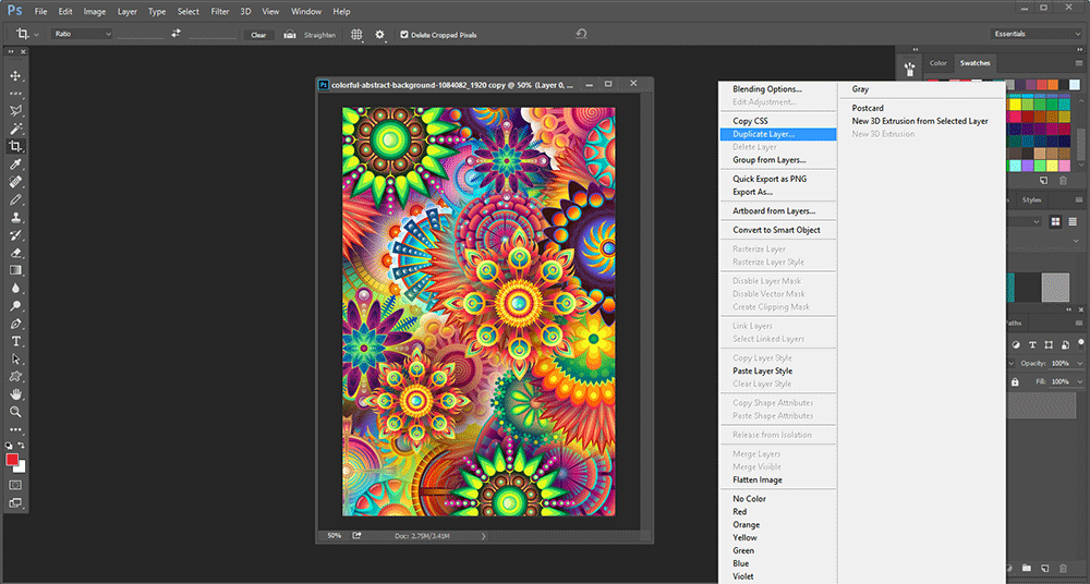
2. First things first, make a copy of your image so you’re not working on the original file. Go to IMAGE > DUPLICATE. You can choose a new name for your image otherwise just click OK. Close the original file so your workspace doesn’t get too cluttered.
3. By default the background layer of your image is locked (which means you can’t make any changes to it) so we’ll need to unlock it. Right-click on the layer and select LAYER FROM BACKGROUND or just double-click the background layer. Click OK.
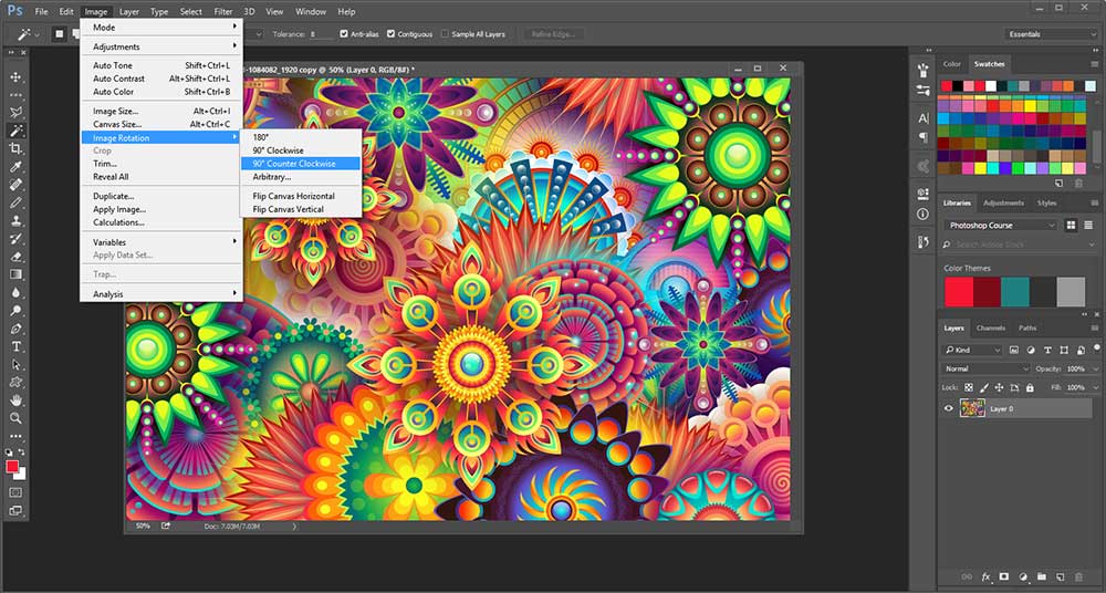
4. While we were working on our branding guidelines we decided that 800 x 1200 is the best size for our blog design. Since the image we downloaded is 1920 x 1289 we’ll need to make some adjustments. We could always crop out an area to make it the size we want, but in this case we want to use the whole image because we like the design. So instead of cropping let’s rotate it. Go to IMAGE > IMAGE ROTATION > ROTATE 90 DEGREES COUNTER-CLOCKWISE.
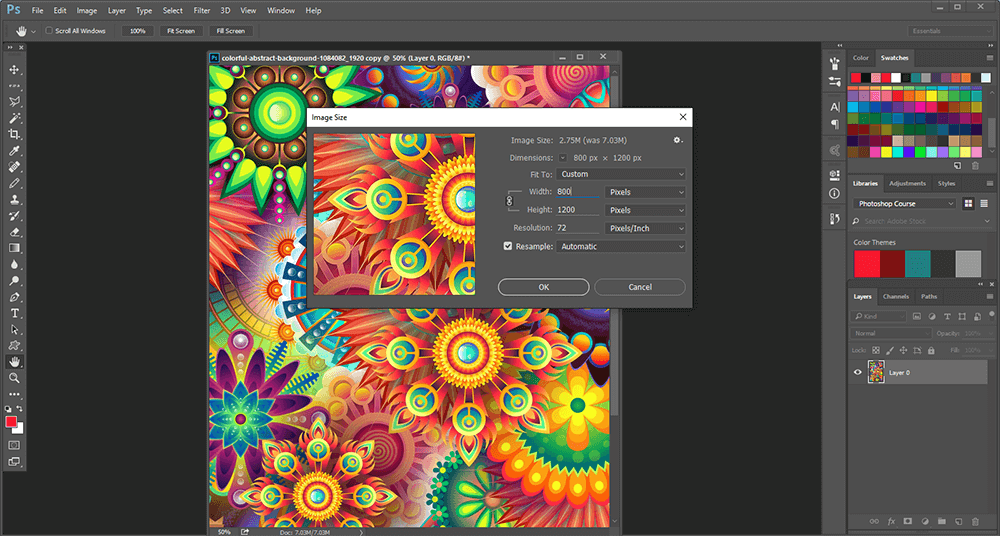
5. Adjust the image size by going to IMAGE > IMAGE SIZE and then enter your pixels next to Width (800) and Height (1200).
6. Now before we start going too crazy with our design we need to make a copy of the background layer. I know…kinda OCD but you’ll feel better knowing it’s there. Sometimes you can get really carried away and when stuff starts blowing up you’ll always have yet another copy of your original image right there. Right-click on the background layer and select DUPLICATE LAYER or drag the background layer down to the CREATE A NEW LAYER tab in the layers palette.
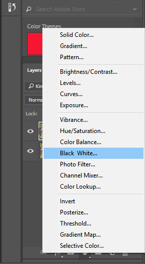
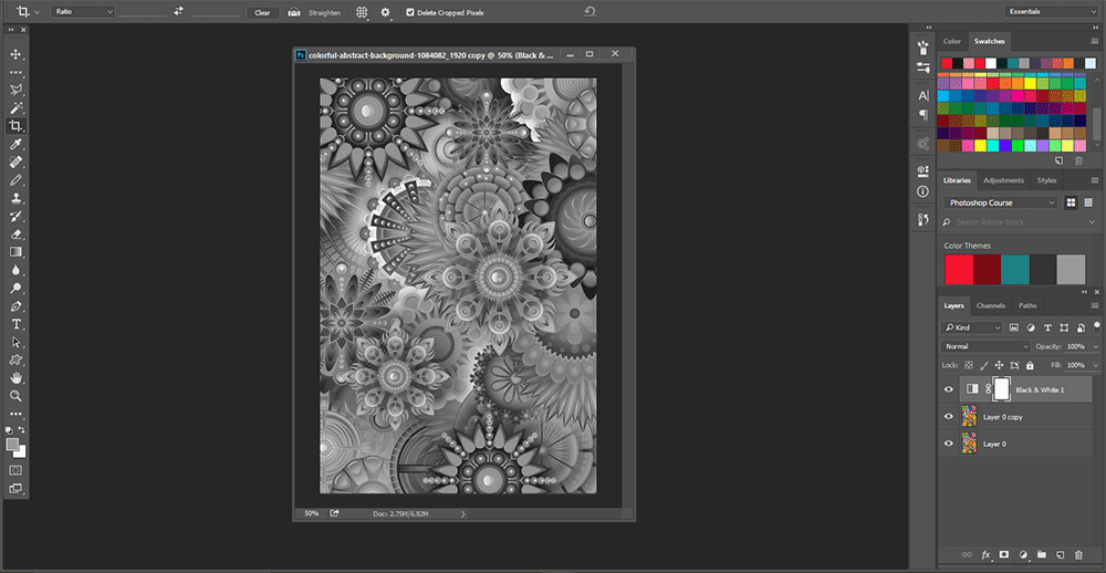
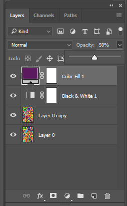
7. We want to stick with our branding guidelines and use a purple #5A1A5E overlay from our color palette. But in order to do that we need to make the image black and white first. In the layers palette click the CREATE NEW FILL OR ADJUSTMENT LAYER and select BLACK WHITE.
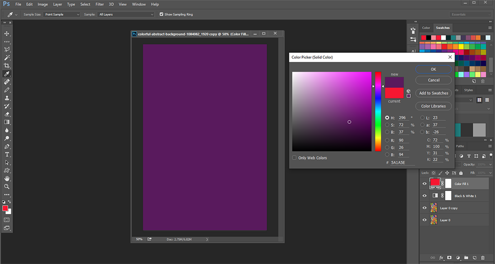
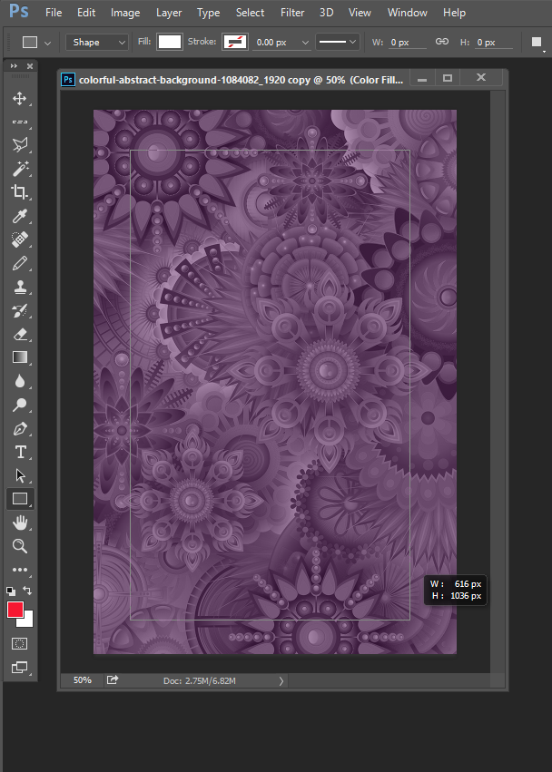
8. Create another fill or adjustment layer only this time select SOLID COLOR from the menu and enter 5A1A5E as your hex code. Make sure the purple color fill layer is selected and decrease the opacity to 50%
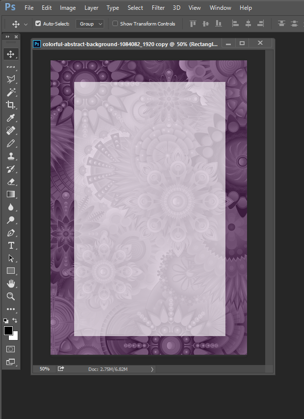
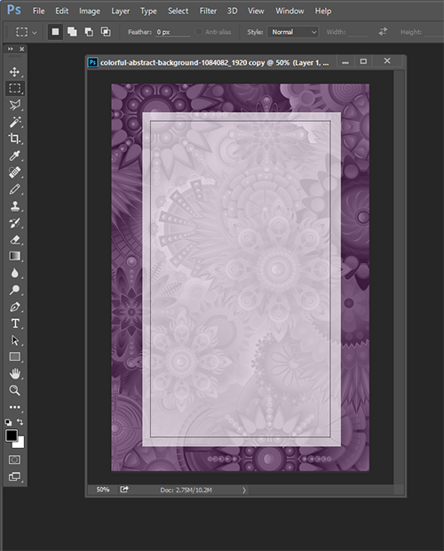
9. Add a white overlay over the purple overlay so we can add our text. Select the Rectangle Shape Tool, use a white fill and decrease the opacity to 65%. The dimensions of my overlay is 616 x 1036 pixels.
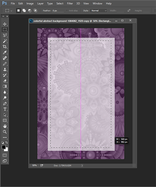
10. Add a thin border to the inside of your white overlay using the rectangular marquee tool. The dimensions of my border is 560 x 982 pixels. Hold down the spacebar while you position the outline. Once your outline is selected create a new layer in the layers palette and go to EDIT >> STROKE > 1 px and click OK. Then press CTRL+D (PC) CMD+D (Mac) or go to SELECT > DE-SELECT.
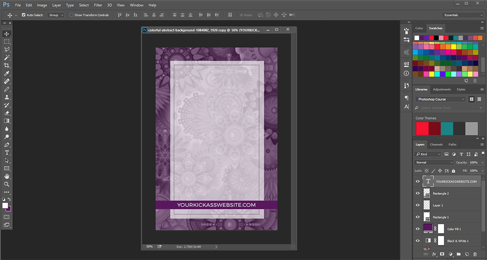
11. Add a rectangle for our URL bar to the bottom of the image. Create a new layer and make your bar using the rectangle shape tool and our purple color #5a1a5e. Create a new layer and select the text tool. Since we’ve chosen Montserrat as one of the main typefaces for our brand that’s what we’re going to use. Click on the URL bar to add your text and adjust the size as needed.
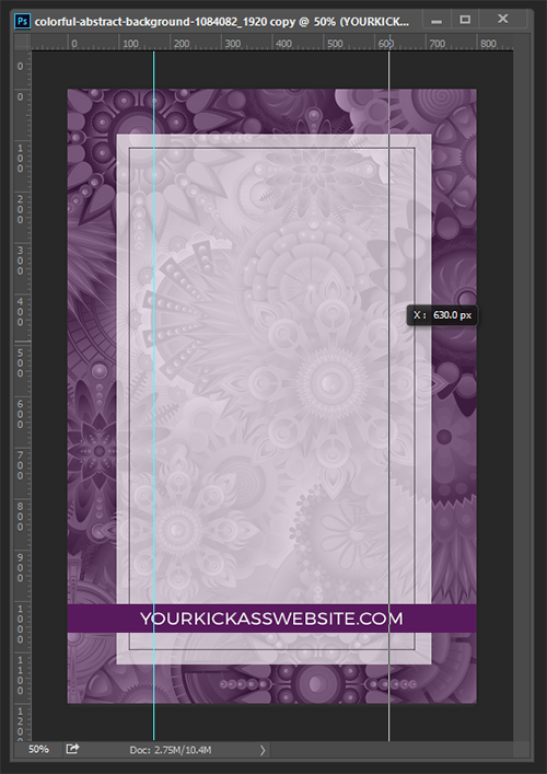
12. To make a life easier you can also add some guides to help you line up the text for your blog post title.. Press CTRL+R or CMD+R to make your ruler visible and then drag your vertical guides over from the left side of the window. You can also add new guides by going to VIEW > NEW GUIDE. I set my guides 170 px from each side of the image.
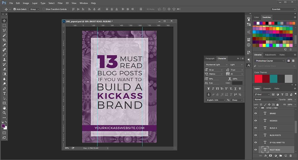
13. Text in Photoshop can be tricksy (Illustrator is better). You’ll want to make sure you have the CHARACTER palette open as you go along so you can easily adjust the size, leading, and tracking (spacing) of your text so it lines up nice and pretty.
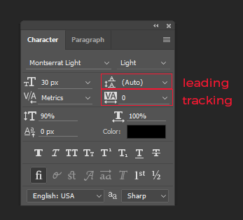
You might want to tinker around with the fonts so you can see how everything works but these are the fonts I used:
Text Layer 1: ‘13’ Montserrat Black, font size 220px, color #5a1a5e
Text Layer 2: ‘Must Read’ Montserrat Light, font size 82px, 72px leading , 25 tracking, color #333333
Text Layer 3: ‘Blog Posts’ Montserrat Light, font size 74px, 25 tracking, color #333333
Text Layer 4: ‘If You Want To’ Montserrat Light, font size 53px, 50 tracking, color #333333
Text Layer 5: ‘Build a’ Montserrat Light 117px, 25 tracking, color #333333
Text Layer 6: ‘Kickass’ Montserrat Semi-Bold, color #5a1a5e
Text Layer 7: ‘Brand’ Montserrat Light 125px, 50 tracking, color #333333
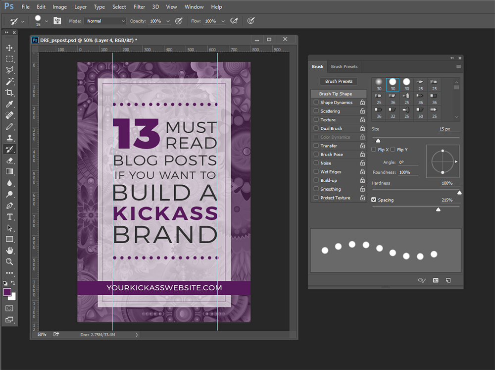
14. We’re almost done! Our image is still missing a little somethin-somethin’. A quick way to add a decorative element to your image is with a simple dotted line. Create a new layer and go to the paintbrush tool. If it’s not already open press F5 to access your Brush palette. Deselect Shape Dynamics and Smoothing. Increase Hardness to 100% (that’s what she said), spacing to 215%, and size to 15px. While you hold down the Shift key paint your dotted line between your guides. Duplicate your dotted line layer and use the Move tool to move it down to the bottom of your text.
15. Voila! If you want hide the ruler and guides to admire your finished project press CTRL+R or CMD+R and CTRL+H or CMD+H.
Best Practices for Saving Your Image for the Web
You’ve done the hard work…now it’s time to save your image so you can display it with pride on the Interwebs!
Unless I need transparency for my image I typically save it as a JPEG since that keeps the file size down and is ideal for photo-type images. If transparency is a must you’ll want to save your image as a PNG or GIF. However if you’re working with a lot of solid colors sometimes a PNG looks better than a JPEG.
It can be a little tricksy keeping your file size as small as possible while maintaining image quality but Photoshop’s SAVE FOR WEB feature helps out a ton.
Go to FILE > EXPORT > SAVE FOR WEB and click on the 2-UP tab located at the top of the window. This allows you to see your original image in all it’s glory and compare it to how it’s going to look on the web. If the image has a major focal point or more detail that doesn’t appear in the window you can drag it around.
Do your best to keep your image file sizes around or below 100K. Make sure the OPTIMIZED checkbox is ticked and you can you use either the QUALITY drop-down menu or the slider to adjust your image.
Mind you, everything I’m telling you here is not 100% set in stone. Optimizing your images for the web is both an art and a science. If you wanna get your geek on and get the total low-down on optimizing images for the web I recommend going straight to the source and reading this article in the Google Developers Web Fundamentals help files.
Their tips on how to select the right image format for your web project is pretty badass.
In this case the HIGH (60%) quality image looks pretty good compared to the original PSD file but the 171K file size is still a little too big. On the other hand, the MEDIUM (30%) quality image is a lot smaller at 91K but it’s too grainy for my liking. So I’m going to compromise and set the the quality with the slider at 45% which leaves me with a 122K image.
Works for me!
So there you have it! You’ve just created your first branded blog image using Photoshop.
That wasn’t sooo bad was it?
Now you can save you PSD file and the next time you need an image for a blog post you can whiz-bang it out in no time flat. Simply swap out the background image, change your color overlay to a different color in your color palette (or just keep it the same if that floats your boat), and change your text.
Easy-peesy!
Wrap Up
Yes, Photoshop has a learning curve that’s a little more steep compared to other free or lower-cost image editing programs like PicMonkey or Canva. But that doesn’t mean it’s not worth your time. On the contrary, you can feel just as comfortable working with Photoshop and get more done in less time once you know the basics. In fact, I can pretty much guarantee once you get to know Photoshop a little bit better you’ll both be BFFs for life.
ONE MORE THING before you go (you’re going to la la loooove this), scroll to the bottom to snatch up my gift to you!
 Recovering perfectionist, wannabe minimalist, and digital nomad in training at Laptop Lifestyle Mom. Amanda teaches VAs, bloggers, and mompreneurs how to blast through the technical roadblocks that stand between them and their dream biz. To receive a free video tutorial that takes you step-by-step through everything you learned in this post head over here.
GRAB YOUR FREE COPY OF
THE QUICK & DIRTY GUIDE TO BRANDING FOR SOLOPRENEURS

This 25+ page ebook is a bloat free recipe that will help you gather, prepare and assemble ALL six main ingredients you need to create a unique AF brand identity your peeps will love eye guzzling.
PLUS, the entire ebook is loaded with tons of exercises, resources and examples, so you’ll have everything you need to start creating your brand identity TODAY, regardless of where you are in your business.