


There are two sure fire ways to infuse your brand identity into your images, and make them more memorable…
1. Adding a headline or call to action in your font theme
2. Applying your color palette to elements
One of the simplest ways to kill both of those birds with one stone is to use a transparent overlay!
A transparent overlay is simply a layer of color with a transparency to it, which lays on top of the background of your image.
Transparent overlays are perfect for images because they create an even backdrop of color for adding text in a way that’s actually readable, AND they give you a simply way to infuse your brand color palette.
I call that a win, win, baby!
Here are 3 types of transparent overlays that work like gangbusters…
1. FULL COVERAGE OVERLAYS
These are transparent overlays that cover the entire area of the background of your image.
There are 4 types of full coverage overlays that reign supreme:
- Single color
- Two color radial gradient
- Two color linear gradient
- Three color linear gradient
Here is a side by side of each type, with the color swatches that were used in each directly below.
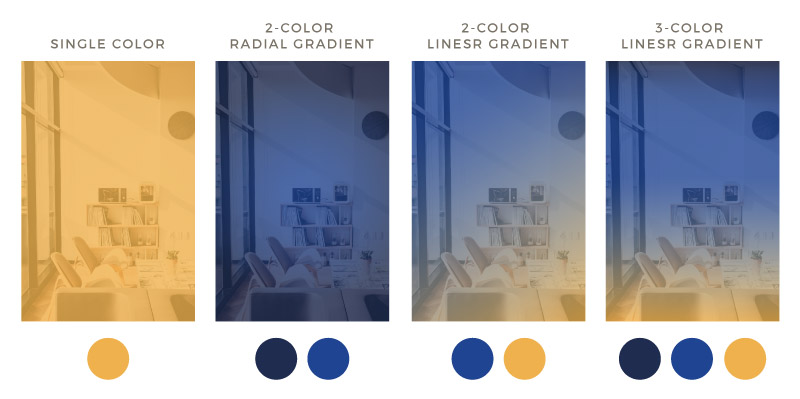
Keep in mind that you can also rotate your full coverage overlay to any angle to get the look you want, whether that be horizontal, vertical, or any where in between in either direction.
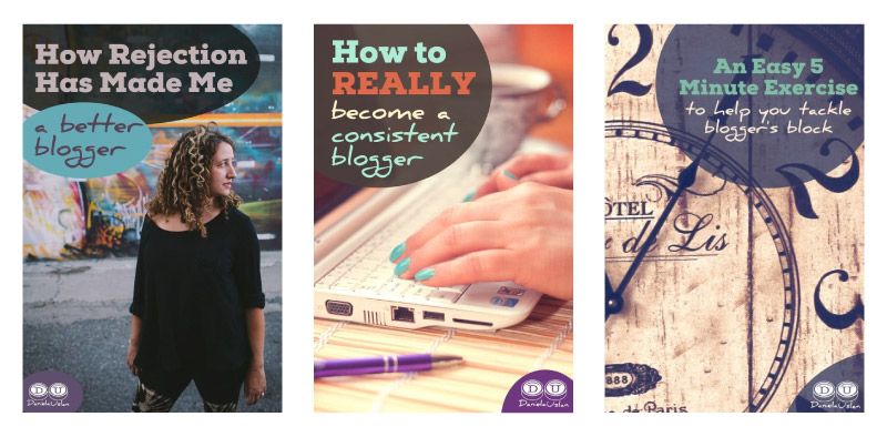
Here are a few real world examples from brands who use full coverage transparent overlays in their images.
259 WEST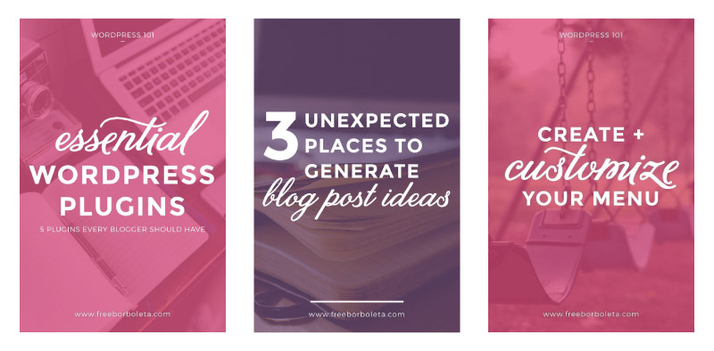
Sophie VL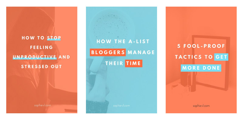
KEEP CHASING THE STARS
2. SHAPE OVERLAYS
If using a full coverage overlay feels like too much a great alternative is a shape overlay.
A shape overlay really captures the ‘uniqueness factor’ because of the endless ways you can approach it. Let me be blunt, you can still create a look that hasn’t been done 912 times already!
Between the basic shape you choose and where you position it on your image, there’s always a way to find a style you can make your own.
Here are a few real world examples from brands that have created incredibly unique signature styles in their images using shape overlays.
Daniela Uslan
ASHLEY BEAUDIN
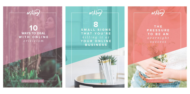
KRISTA AOKI

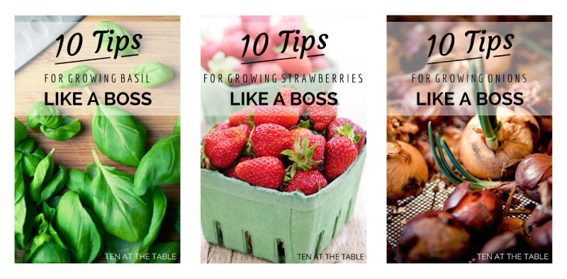
3. BAND OVERLAYS
The last type of transparent overlay that works like gangbusters for adding text to your images using your font theme and infusing your color palette is a band overlay, which is simply a bar that runs across the width of your image.
Band overlays are particularly great for brands who use photography backgrounds in their images, like food, decor, and beauty based brands.
The band overlay still provides a place to add text, without obstructing any products, decor, or cuisines you’re featuring.
Here are a few real world examples from brands who use band overlays in their images.
MARIA HALTHOFF
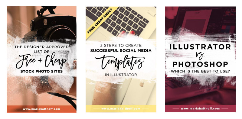
SWEET TEA & THYME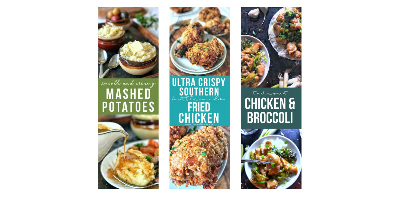
Ten At The Table
WRAP UP
Now that you know how to use transparent overlays to create a unique look that’ll be instantly recognizable, it’s time to get busy creating your signature style.
Choose the type of transparent overlay that fits best with the assets in your brand identity and let the creating begin!
If you still don’t have a font theme or color palette that you’re absolutely lovestruck over, snatch up a copy my free eBook ‘The Quick & Dirty Guide to Branding for Solopreneurs’. It’ll walk you through exactly how to create a kickass brand identity, even if branding and design are all new to you!
GRAB YOUR FREE COPY OF
THE QUICK & DIRTY GUIDE TO BRANDING FOR SOLOPRENEURS

This 25+ page ebook is a bloat free recipe that will help you gather, prepare and assemble ALL six main ingredients you need to create a unique AF brand identity your peeps will love eye guzzling.
PLUS, the entire ebook is loaded with tons of exercises, resources and examples, so you’ll have everything you need to start creating your brand identity TODAY, regardless of where you are in your business.